


User Research & Insights, Interaction Design, Visual Design, UX Design
2022-2023
In any restaurant operation, managing the menu is more than just listing items. Restaurants need to frequently update dishes, adjust stock availability, categorize menu, and add new variants, while ensuring that what's on the screen matches what’s in the kitchen.
Restaurants change fast, so the tools they use should keep up. We focused on making everyday tasks like updating menus and tracking stock feel smooth and second nature.

We couldn’t just build a basic menu list, restaurants need a system that reflects how they actually run things in the kitchen. That means handling multiple product types, keeping track of stock, managing categories, and setting up custom variants. The challenge was to make that complexity feel easy and flexible for different kinds of users.
Menus can be complex and ever-changing
Restaurants often update items—whether it's a price change, out-of-stock dish, or a new seasonal variant. Trofi had to make it easy for teams to add, remove, or update products without disrupting daily operations.
Not all users are tech-savvy
From small business owners to kitchen staff, not everyone managing the menu is used to complex tools. Trofi’s interface had to be simple enough for anyone to use, while still offering powerful features in the background.
Everything needs to stay connected
Menus, categories, stock, and variants don’t live in isolation. Trofi had to ensure that editing one part of the menu didn’t break another. The system had to feel smooth, predictable, and consistent from end to end.
We combined qualitative and quantitative research to confirm we were solving real problems
Qualitative Research
Conducted user interviews with restaurant owners and staff in Indonesia to understand how they handle daily operations, track orders, manage promotions, and process payments.
Quantitative Research
Ran surveys to identify the most common pain points and feature priorities, helping define the focus areas for Trofi.
Due to confidentiality, I’m unable to disclose specific research details in this module.
Organizing the backbone of every menu
To design this module, I broke down the menu management flow into smaller, focused components: Menu List, Categories, Variants, and Stock. In Trofi, we refer to variants as options, which are later grouped into option groups. As for stock, we refer to it as either recipe or inventory, depending on the context.
The bigger picture
The initial goal is to update/manage all food & drink menus to ensure the digital menu reflects real-time availability. In addition, managing a menu goes beyond just adding dishes. Every new or existing item can carry its own recipe and option groups, ensuring consistency across the POS system. That’s why initially, recipe linkage and option management live inside the add/edit item flows, where they naturally belong.

Image: User journey flow
No matter the screen size
Making Trofi works on any screen was always essential. Mobile and tablet keep operations fast, while desktop delivers powerful dashboards for business insights.
On the desktop dashboard version, users can create menus the same way they do in the app. The difference is that the dashboard allows them to create multiple menus at once (bulk).

Image: Trofi responsive design
Every dish begins here
Creating a menu is the first step in getting any restaurant system up and running. The flow covers how users add new items, set their prices, assign categories, and organize everything in a way that’s clear and easy to manage.

Start by adding a menu item
If no menu items exist yet, users are shown a blank screen with a primary CTA to add a new menu. This minimizes distractions and guides them toward the next step.
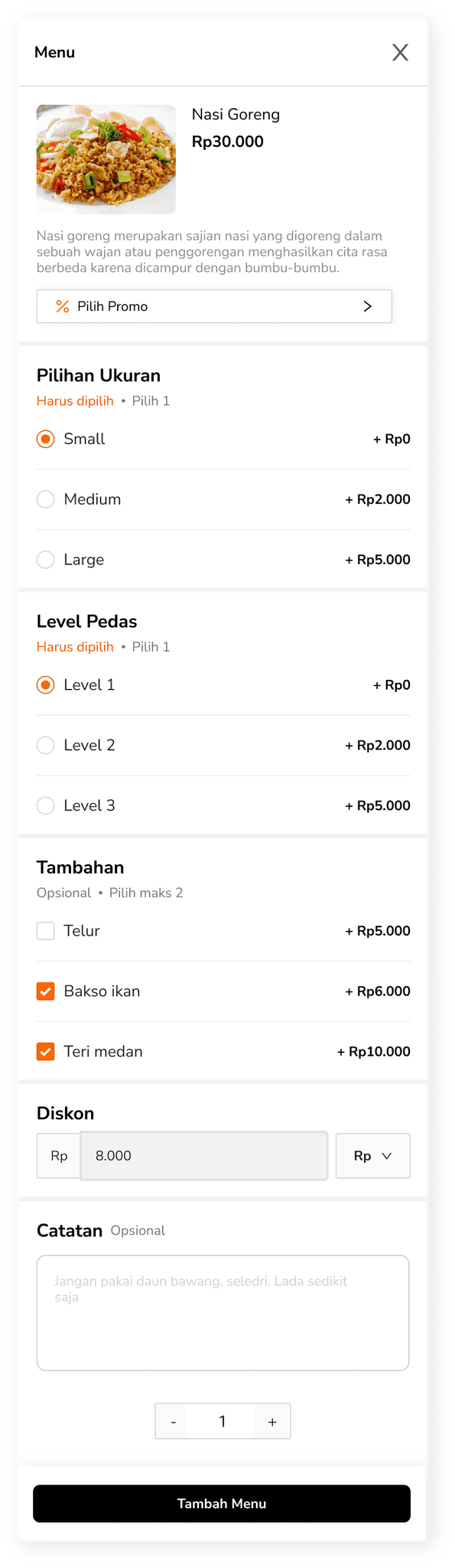
On the Add Menu page, users are required to fill in essential fields such as the menu name, price, and category. They can also optionally assign Option Groups (which are additional variants customers can choose from) or connect the menu to a recipe that pulls from inventory.
Once saved, the new item appears in the menu list. This confirmation gives users a clear sense of progress and confidence that the item is ready for use.
Organize with categories
Users can create a category by entering a name, with an optional description. This helps organize menu items for easier management and navigation.
Once saved, the category will appear in the list and can be assigned to menu items. This ensures that the menu remains structured and scalable as more items are added.

Simple setup, dynamic filtering
Assigning categories to menu items also enables filters in other pages like order selection and menu management. Once categories are set, they automatically appear as filter options, allowing users to sort and view menus by type more efficiently.

Flexible stock management built into every dish
Recipe items—also known as “inventory”—represent the stock behind each menu. This system allows restaurants to manage ingredient availability and keep everything synced between the kitchen and the screen.

When creating a menu item, users have the option to link it to a recipe. This connection ensures that every sale reflects directly on inventory, keeping stock accurate without extra steps. In Trofi, recipes are built from existing inventory items and help teams stay on top of supply levels.
A full breakdown of inventory can be found in the Inventory module.
More ways to customize menu
Option Groups are basically variants. It let users define a set of choices for a menu item, such as spice level or portion size. From required selections to pick limits, it can be set up to suit the way the item should be ordered.

Each group can contain multiple options, and users can decide whether selecting one is required, as well as setting a maximum number of options that users can choose.
When adding an option to the group, users can either select from existing menu items or create a new custom option from scratch.
Option Type 1: Choosing from existing menu
Options are pulled from previously created menu items. If these menu items already have recipe, the selected option will automatically inherit the same recipe or inventory connection as the menu.

Users can still set a specific price for each option, even if it’s linked to an existing menu item. To improve clarity, a “View Option Recipe” button is included on the Add Option page, allowing users to check which inventory items are linked to the selected menu option.
Option Type 2: Create new custom option
Users can also create new options from scratch. If needed, these options can be linked to recipe to help track inventory. The flow for adding a recipe to an option follows the same pattern as linking a recipe to a menu item.

Main Recipe and Option Recipe
In addition to option recipes, there's also a main recipe—this refers to the inventory linked directly to the main menu item. When a menu is sold, both the option and main recipe inventories are reduced accordingly.
Below the option recipe section, there's a banner labeled "See Main Recipes" where users can see the ingredients (inventory items) linked to the main menu item. This helps them stay on top of what ingredients are being used.


An empty state is displayed when the menu has no connected inventory.
Options stay flexible
Each option in a group can be customized at any point—whether to update the name, tweak the price, or simply turn it off when it’s not needed. This gives users the flexibility to keep their menu aligned with changing availability or preferences without starting from scratch.

Responding to real usage
Throughout development, several adjustments were made based on testing, edge cases, and evolving user needs. These iterations helped shape a more robust and flexible system, both in logic and UI.
Integrating across the journey
As Option Groups were introduced later through product iterations, several related screens required adjustments and the most noticeable changes happened in the Order flow. This includes refining how users add items to cart, view order details, and checkout experience.
Add to cart modal

Detail order page
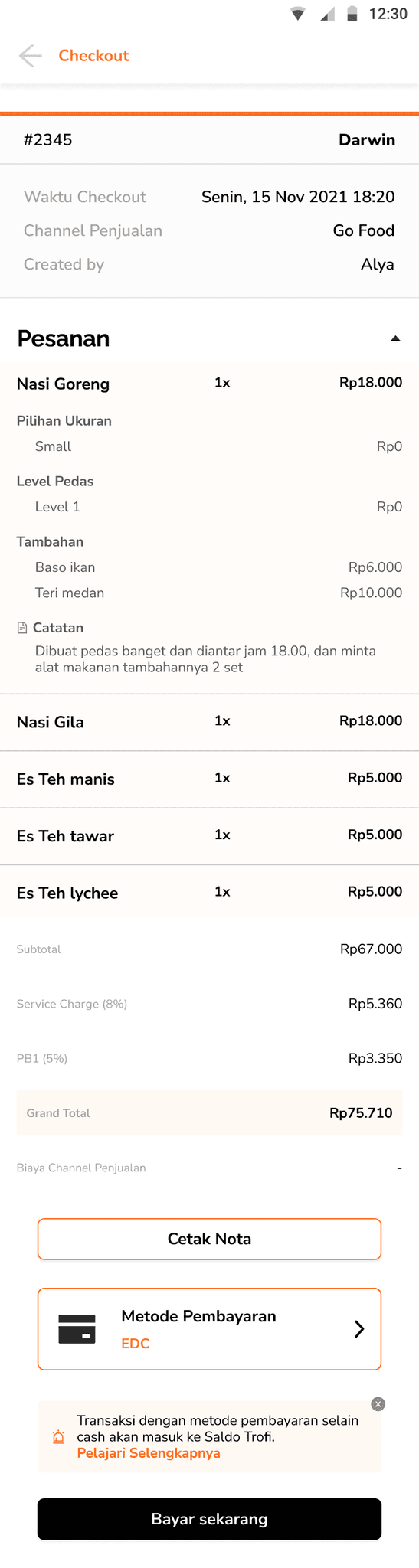
Checkout page
From simple Add-ons to structured Options
As menu variants became more detailed and complex, we needed a scalable structure to manage them. Option Groups were then introduced to provide clear grouping, custom rules, and deeper integration with inventory. In the earlier development, extra selections like spice level or toppings were treated as simple “add-ons.”

Redesigning Option Group entry point
The original button to add Option Groups blended in with several other similar-looking actions on the menu page. To organize the interface more clearly, we decided to replace it with a more prominent banner that leads to a dedicated screen. This helped reduce visual clutter and makes the action easier to notice and follow.
Additionally, since users might create multiple option groups per menu, placing them on a separate screen prevents the main interface from becoming overwhelming.

Growth through iteration
Separate tab for visibility
Placing Option Groups as a standalone tab—alongside Menu and Category—would make it easier to revisit, reconnect, or repurpose them later. Grouping them this way also aligns with how users mentally organize core menu components.
Dedicated screens for better focus
Instead of inline buttons, components like Option Groups and Recipes might benefit from being designed as distinct pages or card-style modules. Since Option Groups and Recipes can grow in number and complexity, having a separate space helps prevent clutter and gives users more space to manage details.
Smarter selection interaction
Rather than a one-by-one click flow, adding support like bulk actions or multi-select could improve the experience, especially when assigning multiple options at once. This interatction has already been applied in the desktop dashboard. Since it involves a bit more complex interaction, a deeper breakdown of the desktop version will be covered in a separate module.
A Lasting Note
Built with purpose, remembered with warmth
Although the work eventually came to an end, it ran successfully for nearly three years and found a place in the daily routines of real users. Many of them shared kind words when it stopped—and that, more than anything, reminded me why I love building things that help ♥︎