
User Research & Insights, Interaction Design, Visual Design, UX Design
2022-2023
For some restaurant teams, Trofi is where daily operations begin. That makes the entry point critical: owners and staff need to get in quickly, securely, and without confusion. As the product expanded to support multiple outlets and staff roles, the login and sign-up flows had to evolve, ensuring the system could match the complexity of real businesses while staying easy to use.
Designing access for Trofi brought its own unique hurdles. Each challenge pushed the module to be sharper, clearer, and closer to real-world needs.
Balancing security and speed
POS systems handle sensitive financial data, so seucrity was non-negotiable. But in a busy restaurant setting, no one has time for clunky flows. The challenge was creating logins and resets that felt both safe and fast.
Master vs Staff access
One email, many people. Trofi had to handle the difference between the Master account and multiple staff logins, with distinct rules around who could reset passwords, who set PINs, and how each person entered the system.
Error cases without confusion
Forgotten credentials are inevitable. The challenge here was making recovery flows (passwords and PINs) clear enough that users always knew what to do next, reducing frustration in already stressful moments.
High error potentials
Trofi runs across mobile, tablet, and desktop. Ensuring that onboarding, sign-up, and sign-in felt consistent was key to a seamless first-time experience, while also adapting to flows like desktop tutorials.
We combined qualitative and quantitative research to confirm we were solving real problems
Qualitative Research
Conducted user interviews with restaurant owners and staff in Indonesia to understand how they handle daily operations, track orders, manage promotions, and process payments.
Quantitative Research
Ran surveys to identify the most common pain points and feature priorities, helping define the focus areas for Trofi.
Due to confidentiality, I’m unable to disclose specific research details in this module.
Designing the way in
The design process for Sign Up & the other flow was all about weaving together smooth first impressions with practical business needs. It wasn’t just about making forms look neat, but also about mapping out how each step connects—from onboarding slides to staff PINs—so that the journey feels natural from start to finish.
The bigger picture
Before diving into the details of each screen, it was important to map out the bigger journey. For this module, the flow wasn’t a straight line but a branching path, depending on whether the user was a Master or staff, or whether they were logging in on mobile, tablet, or desktop.
Starting from onboarding, the design had to account for different entry points (sign up, sign in, or recovery). Once inside, the outlet iteration added another layer: selecting the right staff name, entering a PIN, and picking the assigned outlet. Visualizing this flow as a whole helped keep things consistent.
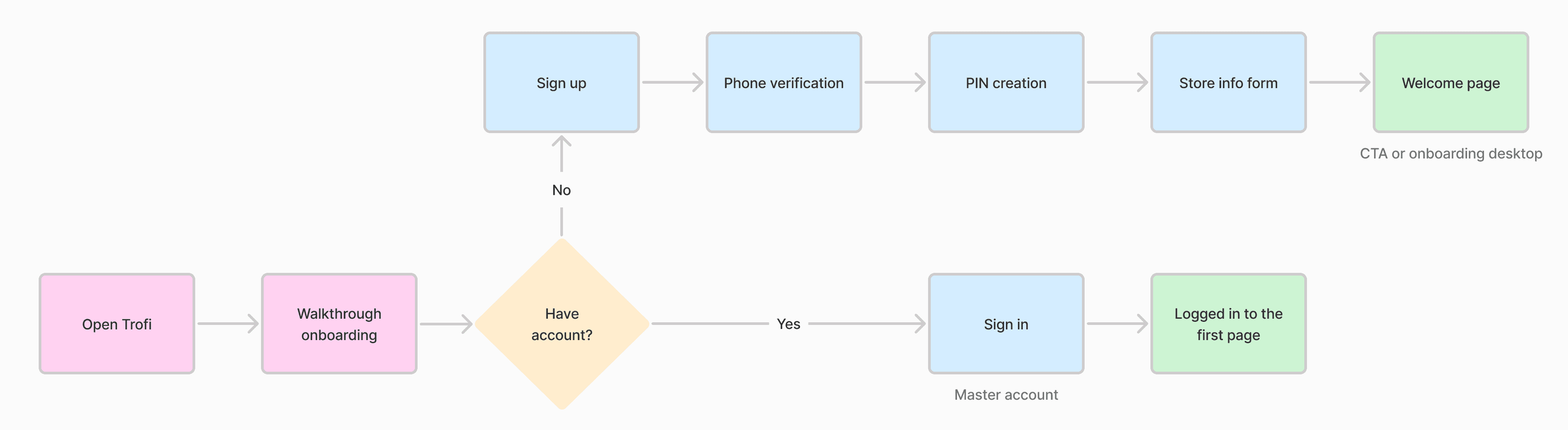
Image: User journey flow for sign up
No matter the screen size
Even though the overall access flow remained consistent across devices, some adjustments were needed to fit each context. On mobile and tablet, the experience leaned on PINs for quick daily access, and since staff often shared the same device in a busy restaurant environment. Meanwhile, the desktop dashboard served a different purpose: it was reserved for the Master account or outlet managers only, so PIN entry wasn’t part of the journey.
The desktop also introduced subtle differences in flow: tutorials and setup steps were presented in a stepper format. While the logic behind the journey was the same, the form it took had to adapt to match the expectations and responsibilities of the user on each device.
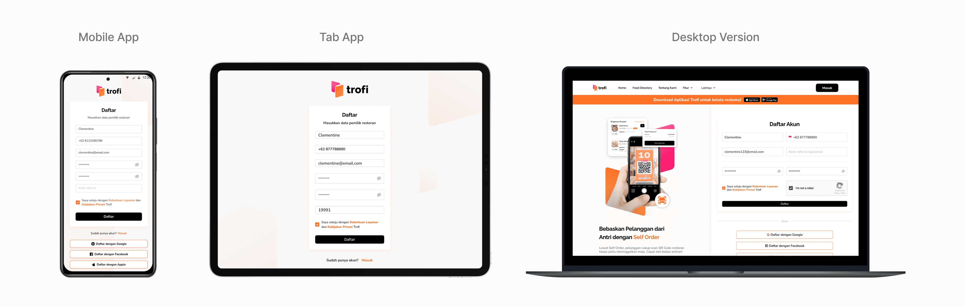
Image: Trofi responsive design
Guiding first steps
The onboarding experience in Trofi is designed to help first-time users feel confident and informed before diving into daily operations. By presenting essential features and initial setup guidance right at the start, hopefully users can how to get their POS ready for use. The onboarding flow is tailored for different platforms, ensuring that the introduction feels native and relevant whether accessed on a mobile device, tablet, or desktop dashboard.
Welcome walkthrough
On mobile and tablet, the onboarding sequence consists of a short three slides that act as an opening handshake with the user. These slides present Trofi’s key benefits and core POS capabilities. Unlike longer tutorials, this version is concise and cannot be skipped.
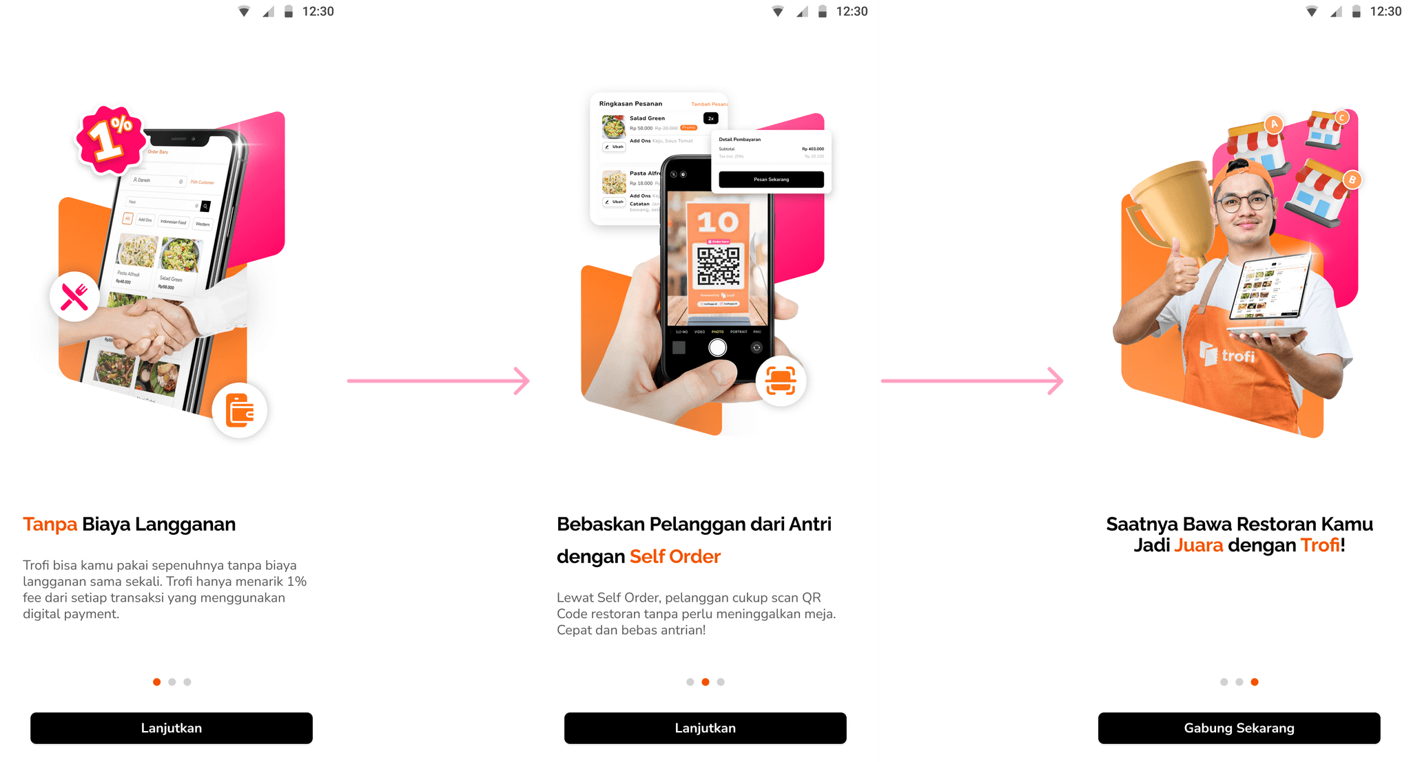
Image: Mobile onboarding walkhtrough
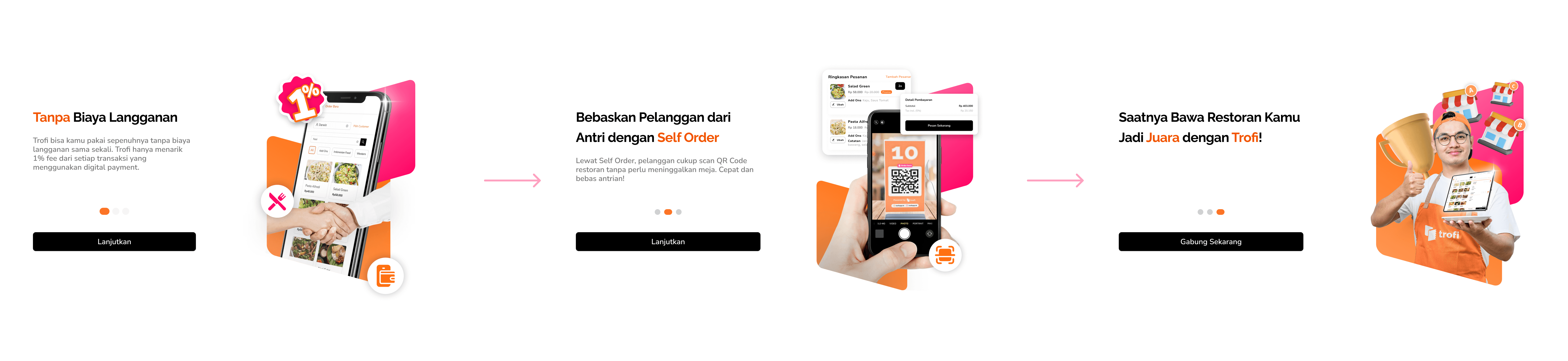
Image: Tablet onboarding walkthrough
Interactive starter guide
The desktop version of onboarding provides a more comprehensive, step-by-step introduction, ideal for new users setting up Trofi for the first time. It begins with essential navigation cues, highlighting primary menu items and their purposes. Key setup steps are introduced early, including configuring charges (such as service fees and PB1 tax), adding staff members, and understanding how to view and interpret sales reports.
The tutorial is interactive, allowing users to follow along while adjusting settings in real time. At the end, users are prompted with a friendly call-to-action to download the Trofi mobile or tablet app, ensuring they can access and manage their business seamlessly across devices. (💡 tip: click or hover over the image for a better view!)
Image: Embedded video tutorial modal
In-app video tutorial
Alongside the guided flows, Trofi also provides a pop-up modal containing a short embedded video tutorial. Users can close the modal at any time or choose to play the video directly within the app. The video offers a quick visual reference for key features, complementing the onboarding steps without interrupting the main flow.
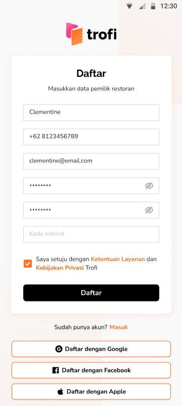
Creating Trofi account
The sign-up flow in Trofi is designed to establish the account owner as the “Master” of the store, ensuring all store's data originates from a verified and secure source. The process combines simple form entry, social integrations, and initial business setup to get users ready for their first transactions.
Image: Sign up flow on mobile
Account creation
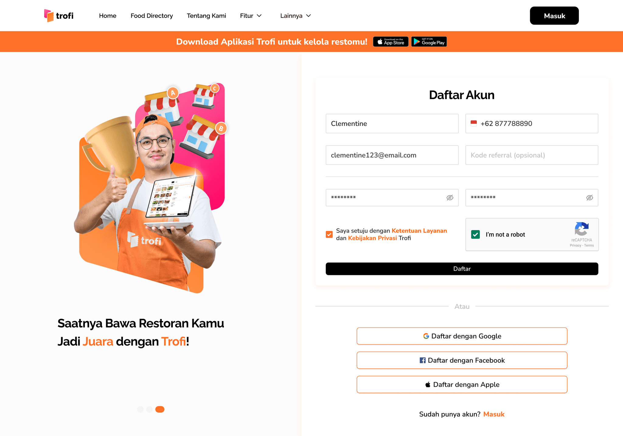
Users begin by creating an account through two possible paths: filling out a registration form or choosing a social login option. The form requests basic but essential information including full name, email address, phone number, password, and an optional referral code. Alternatively, users can register using Google, Facebook, or Apple for a quicker setup. Regardless of the method, the created account automatically becomes the “Master” account, serving as the owner profile of the store.
Phone verification
After registration, users are required to verify their phone number as an added layer of security and identity validation. An OTP (one-time password) is sent to the phone number provided, which must be entered to continue. This ensures that the Master account is tied to an active and verifiable contact, reducing risks of unauthorized access.
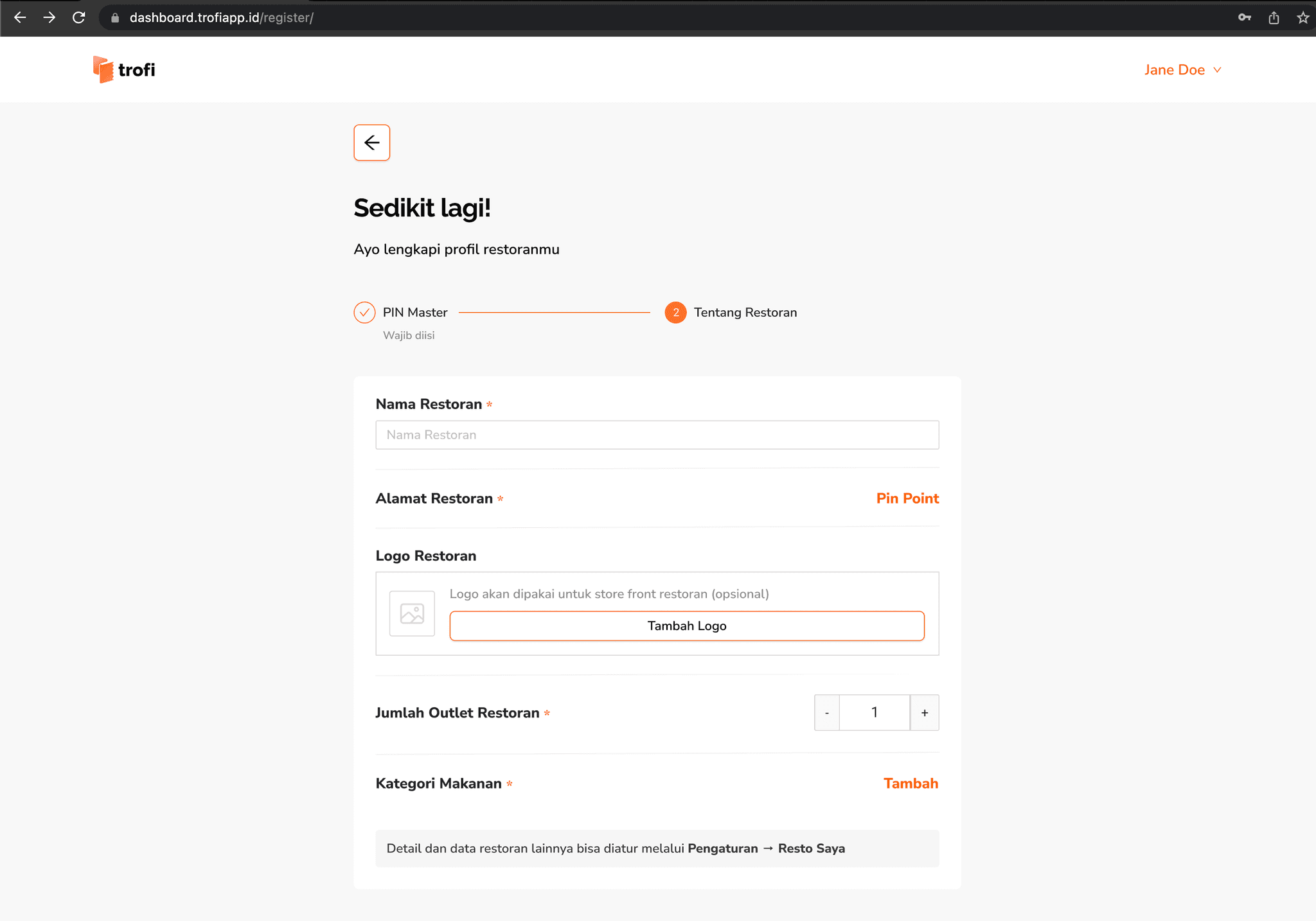
Store setup
Once the account is verified, users proceed to fill up store details. The first step is creating a personal transaction PIN, which will be used for key actions such as approvals or voids. After this, users complete their restaurant profile by entering the store name, marking the location on a map, uploading a logo, specifying the number of outlets, and selecting the food category.
Welcome page
The final stage is a welcome page that confirms the account has been successfully created and the store profile is ready. This screen provides a friendly starting point and includes a clear call-to-action encouraging the user to begin by creating their first menu item.
Desktop version
The desktop sign-up flow mirrors the same sequence as on mobile/tab, but the interface is adjusted for a larger layout. Instead of a continuous form, the process is presented in two steppers. The first stepper is dedicated to creating the personal transaction PIN for Master role, and the second stepper guides the user through entering store information. Once these steps are complete, users are shown a welcome pop-up before being taken directly into the desktop onboarding page. Unlike the mobile version, there is no call-to-action for menu creation at this stage, as the onboarding flow introduces the next steps.
Image: Sign up flow on Trofi website
Accessing the workspace
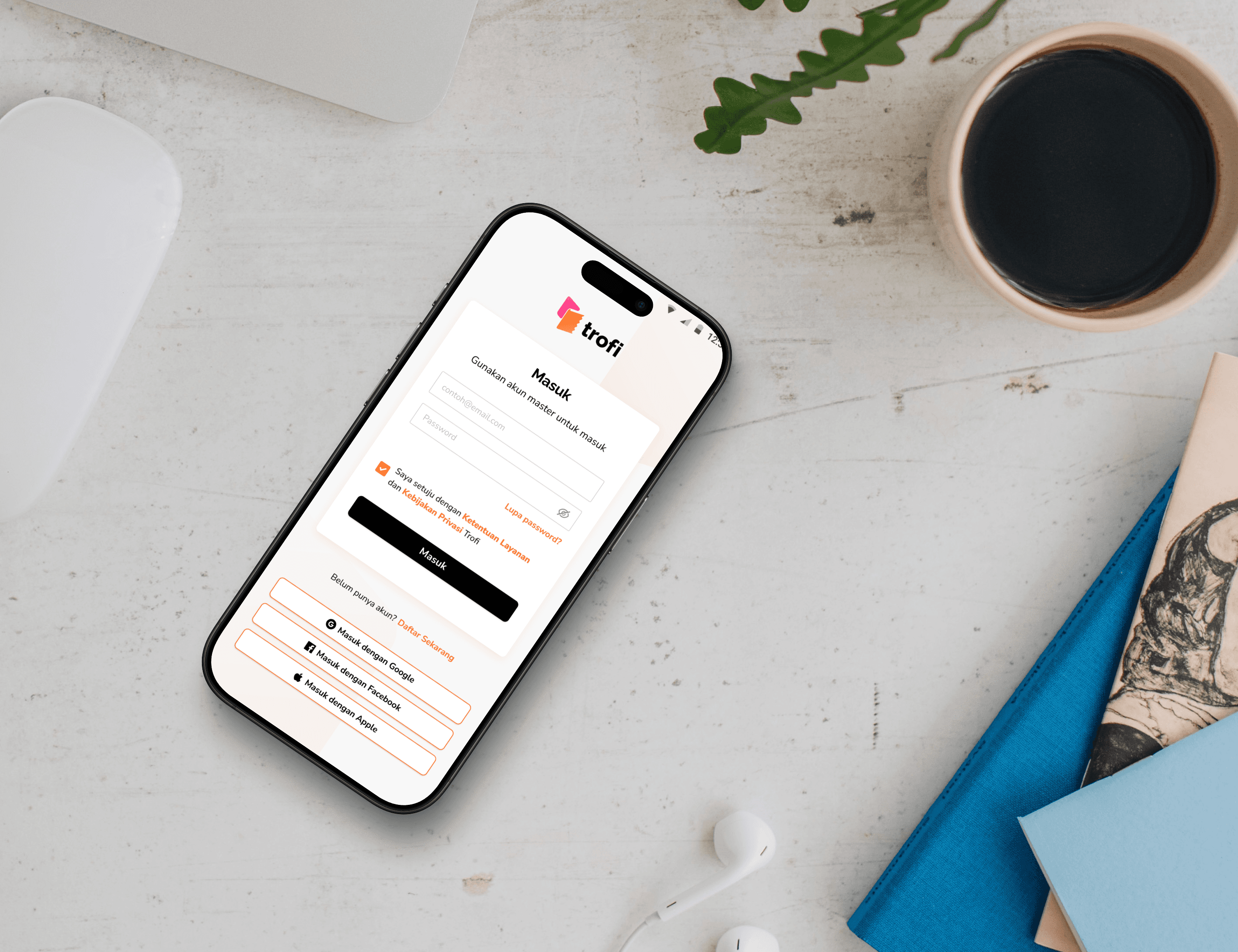
Signing in is kept straightforward so that users can get back to work quickly. On mobile and tablet, the process happens in a single screen where credentials or social logins (Google, Facebook, Apple) can be entered. On desktop, the same options are available but arranged in a wider layout. The flow is familiar across platforms, only adjusted to fit the screen.
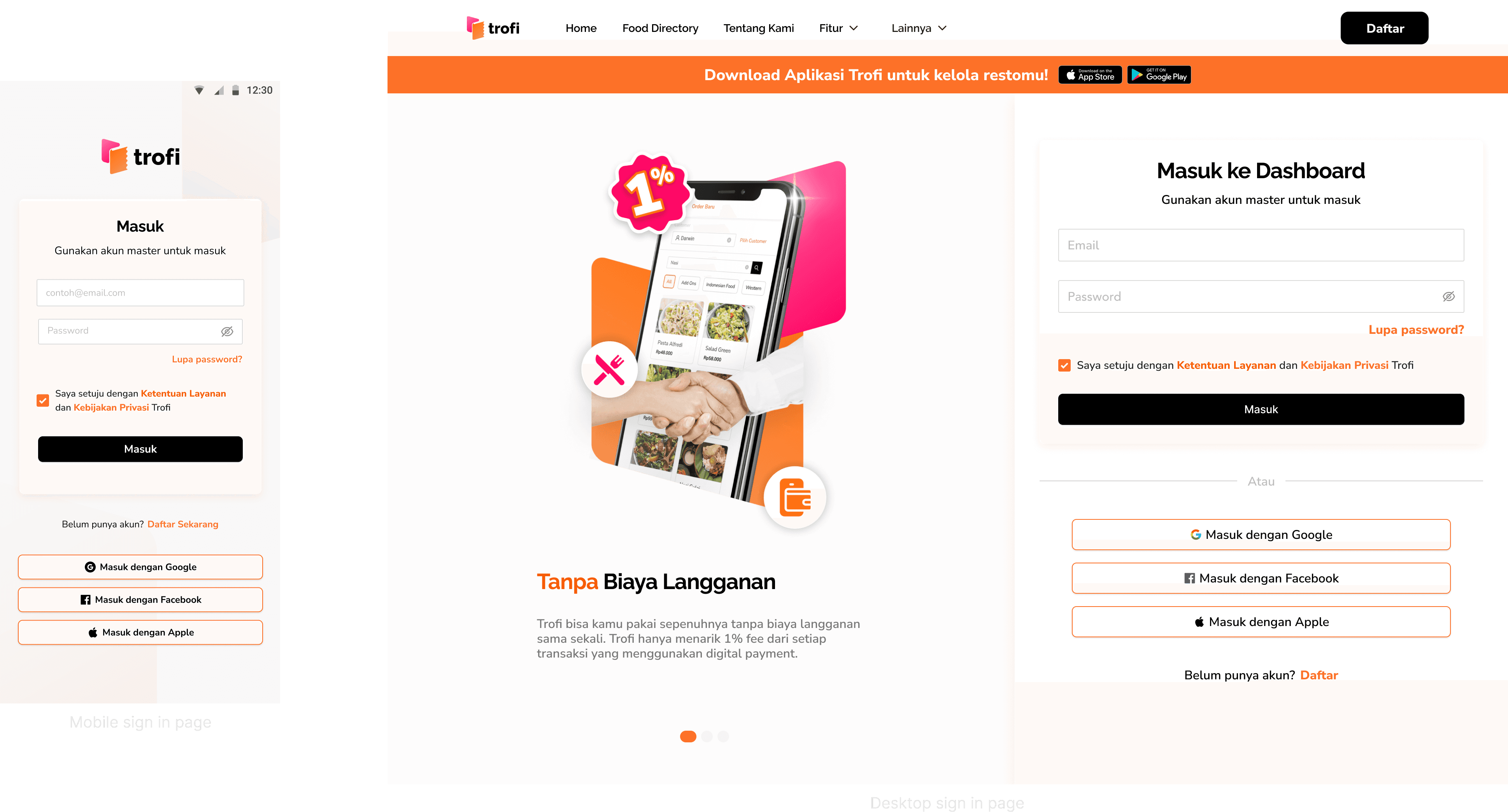
Error handling
When sign-in errors occur, the system provides clear alerts that specify the problem instead of showing generic failure messages. Prompts like “Please sign in with Gmail” or “Email or password is incorrect” give clarity on what needs to be fixed. By pointing out the exact issue, hopefully users aren’t left guessing, making it easier to remember the right way to log in next time and reducing frustration overall.
Recovering access securely
Sometimes credentials are forgotten or need to be reset. To prevent unnecessary friction, Trofi provides straightforward recovery flows that guide users step by step. Each case is designed to be secure but also reassuring, making it clear what’s happening and what to do next.
Lost password
Password recovery is reserved for the Master account only, since this credential controls overall access to the system. To reset, the Master enters their registered email address and receives an OTP for verification. After confirming, a new password and confirmation are entered. Once the process is complete, a success prompt appears and the Master is asked to log in again using the updated password.
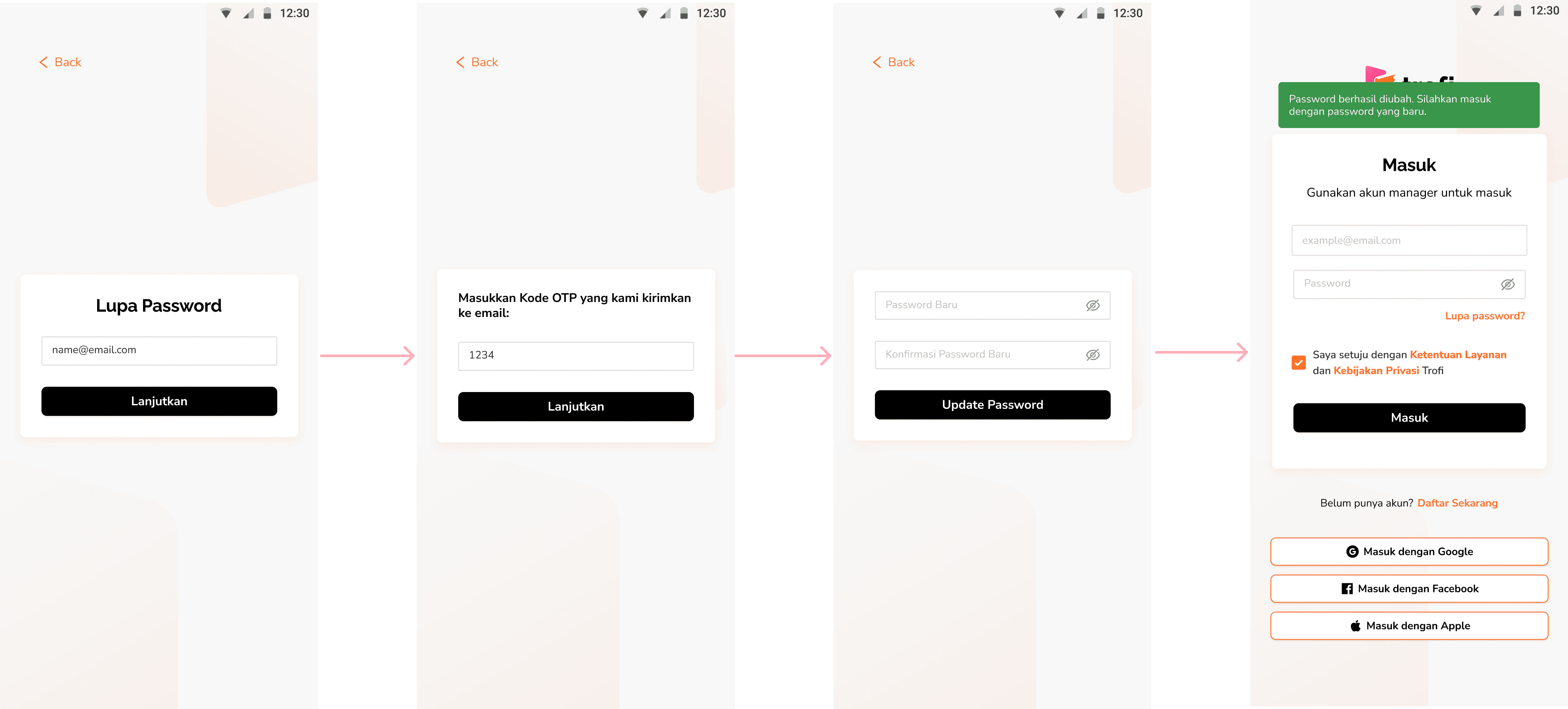
Image: Master password reset flow
Forgotten PIN
For cases where the PIN is forgotten, the recovery flow is kept just as clear and works at the staff level. When a staff member forgets their PIN, the system sends an OTP to the staff’s registered email address stored in the database. After verification, the staff can create and confirm a new PIN, then log back in using the updated code. This ensures security for each individual account without depending on the Master.
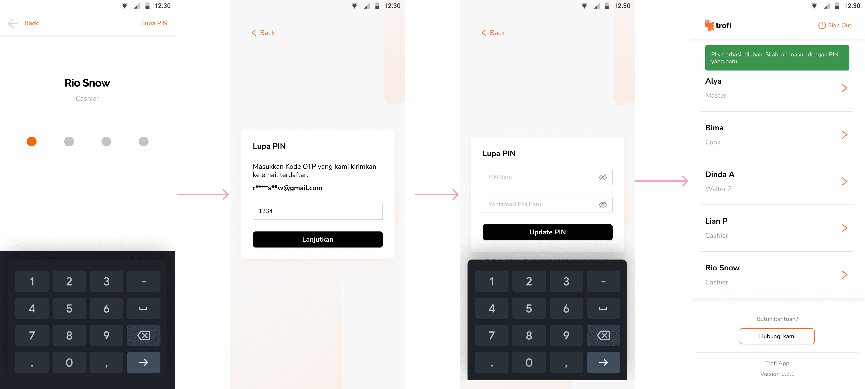
Image: Staff PIN recovery flow
Adapting to multi-outlet needs
As the product grew to support multiple outlets, the original login flow was updated to include new steps. Previously, users accessed the system directly after entering their email and password. With the addition of outlets and staff roles, the flow now adapts to reflect real-world store structures while still keeping the process clear and practical.
Updated flow with outlets
After signing in with the Master account or an outlet manager’s credentials, users are now presented with a list of registered staff members. The staff currently logging in selects their own name from the list, then enters the personal PIN they had set earlier. To make this step more efficient, a search bar is included, helping users quickly find their name in stores with larger teams.
Once staff identity is confirmed, the system prompts them to choose the outlet assigned to their account. This ensures that every session is tied to the correct location, keeping operations organized while also introducing flexibility for businesses with multiple outlets.
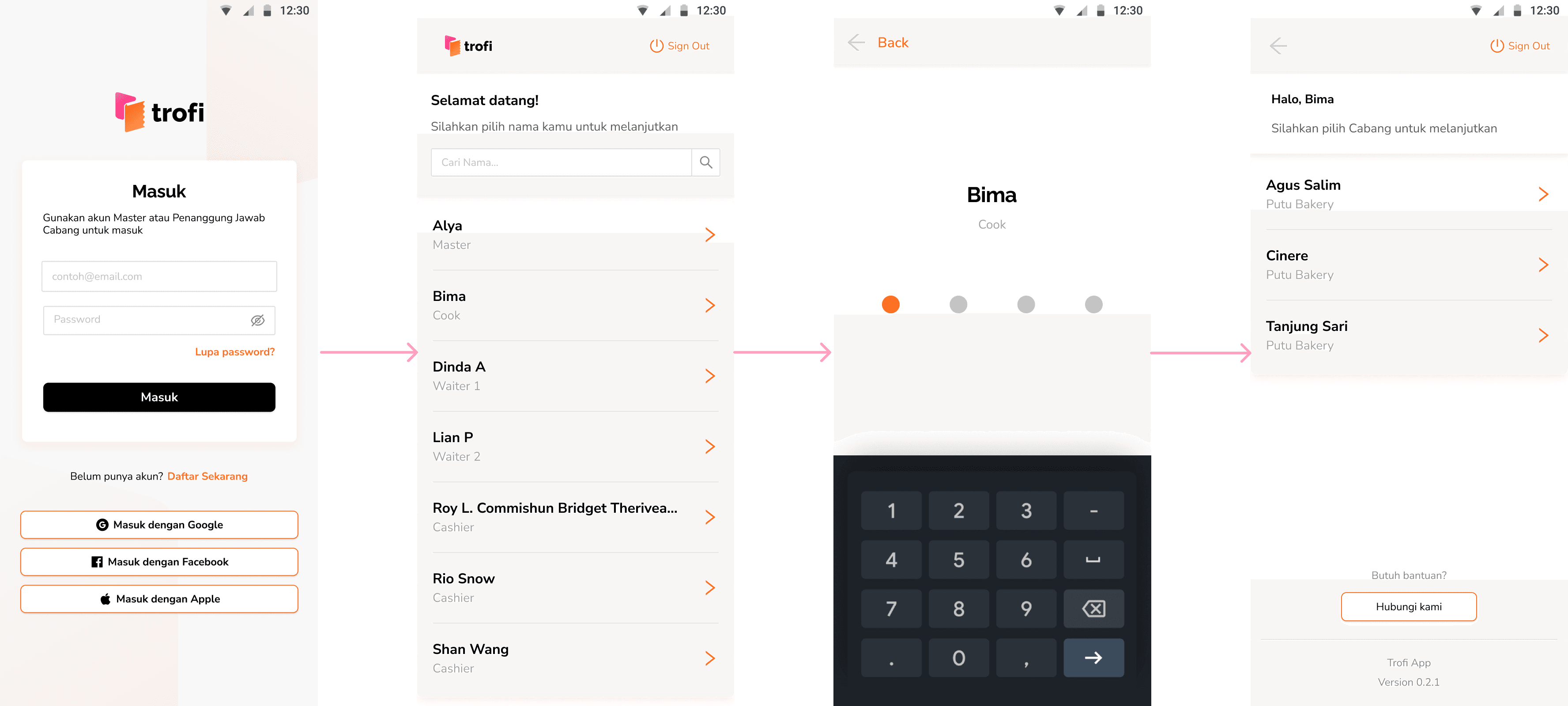
Image: Multi-outlet login experience
Reflections & Takeaways
Design afterthoughts on access
Designing this module felt like stitching together the first steps of the Trofi journey. From cheerful onboarding slides to secure logins and even the not-so-fun moments of forgotten passwords, each flow came with its own set of lessons.
Security balancing
One of the trickiest parts was making things both fast and safe. PINs helped staff get in quickly, while limiting password resets to the Master kept the doors locked tight. Asking users to re-login after changes wasn’t just a rule, it was a safeguard wrapped in routine.
The magic of small details
Tiny touches went a long way. Clear OTP prompts, friendly error messages, and a simple search bar for staff names made the flows feel lighter and less intimidating. Sometimes, the smallest tweaks turned out to be the real game-changers.
Matching real restaurant life
The outlet feature was a big shift, and a happy one. Instead of one generic login, staff could now pick their name, enter their PIN, and hop into the right outlet. It felt closer to how restaurants actually run, which made the whole system click better with day-to-day operations.
What's next on the list
There’s still plenty of room to sprinkle in more goodness: richer onboarding tips, smoother recovery options, and maybe role-based customizations. Each step ahead is another chance to make logging in feel less like a chore, and more like a natural start to the day.
A Lasting Note
Built with purpose, remembered with warmth
Although the work eventually came to an end, it ran successfully for nearly three years and found a place in the daily routines of real users. Many of them shared kind words when it stopped—and that, more than anything, reminded me why I love building things that help ♥︎